


První burger ve stavu beztíže* na světě od @bistro.jak.cyp teď dobývá Hranice! 🌌✨*
Těšíme se na vás v nově otevřené pobočce:
📍Teplická 303, vedle Orlenu – Hranice na Moravě
Kdo už u nás byl? Napište nám do komentářů! 👇
*near zeroG
#BurgeryBezHranic #WorldFirst #ZeroGravityBurger #ZeroG #Hranice #BistroJakCyp #BurgerWithoutLimits #TeschnerGroup

Rebranding pro BENY – příběh řemesla, který jsme převedli do nové éry
Když jsme s týmem BENY začali pracovat na nové identitě a webu/eshopu, věděli jsme jedno — značka, která staví na 50+ letech rodinné tradice, si zaslouží moderní eleganci, ne efekty pro efekt.
Jádrem celé změny se stal jemný redesign symbolu B, který spojuje to nejdůležitější z jejich příběhu:
jemnost šperkařského řemesla, sílu rodiny a úctu k detailu.
Nový web a eshop jsme navrhli tak, aby byl stejně důstojný jako jejich showroomy, které můžete vidět např. na Pařížské ulici v Praze. Čistý, intuitivní a postavený tak, aby vynikl produkt – nic víc, nic míň.
Co jsme vytvořili:
• nový symbol a kompletní vizuální identitu
• prémiovou produktovou prezentaci
• čistý web + eshop s důrazem na jednoduchost a servis
• sjednocený vizuální styl napříč balením, printy i online světem
Výsledek?
Značka s hlubokým příběhem dostala vizuální jazyk, který jí umožní růst dalších 50 let.
—
created by Teschner Group
Branding • Webdesign • E-shop • Creative Direction
#Beny #Rebranding #LuxuryIdentity #TeschnerGroup #Watches #Jewellery #SymbolDesign #VisualIdentity #CreativeStudio #CzechDesign
🎨 Colors of Finance 2025
Už druhým rokem připravujeme společně s týmem Colors of Finance vizuální identitu pro největší finanční konferenci v Česku.
Každý rok ladíme nový vizuál, který má vlastní vibe, ale pořád drží DNA Colors of Finance.
Letos jsme měli možnost předat cenu odborné poroty za nejlepší design stánku, kterou získala společnost Direct Investment.
Gratulujeme vítězům a zároveň děkujeme všem více než 60 vystavovatelům, kteří byli součástí letošního ročníku —
užili jsme si to (a ano, úplatky v podobě merche, alkoholu a dobré nálady přijímáme i příště 😄).
#ColorsOfFinance #TeschnerGroup #VisualIdentity #Finance #DesignAwards #COF2025 #RespectToBusyPeople
@ceskasporitelna @csobcz @mbank_cz_sk @occollo.cz @artisinvest @finvox_as @natlandrealestate @stavebninydek @rockawaycapital @bnpparibas
@gepardfinance.cz @eucs_cz @epet.cz @domoplan.cz @ibisingold_cs @cyrruscz @investona.cz @atrisinvest @direct.pojistovna @efg.holding @areteinvest @investika_is @efekta_brokerpool @codya_investicni_spolecnost @atlantikcz @jtbanka_cz @conseq_cz @scott.weber_workspace @salutem_group @insia_as @ebm_group @brokertrust.cz @sabservis
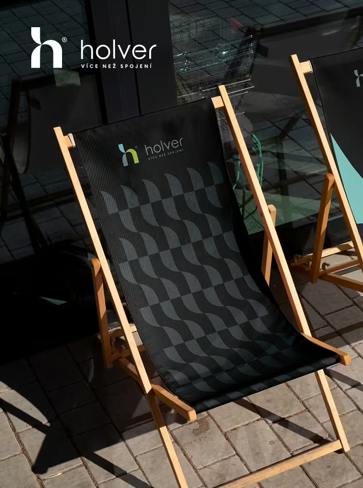
Holver Camp potvrdil, že budování značky není jen o logu.
25 let. Nový web. Nová identita. Symbol „h“, kde každý cíp má svou message — #Lidé, #Příběhy, #Inovace.
Všechno, co vznikalo dlouhé měsíce, bylo najednou všude kolem.
Energii celého dne držela pod kontrolou Yelyzaveta Akymenko.
Kapitán holveru, Mojmír Kramný, kromě sportu a zábavy přidal do programu i workshopy — a právě tam jsme s Jan Teschner otevřeli téma budování značky.
Mezi účastníky jsme se stihli potkat například. s Martina Štichauerová
Petra Dorotíková, Daniel Bechný… A nakonec dýmka s Alan I.
Ještě jednou děkujeme za pozvání a k 25. narozeninám přejeme hodně úspěchů.
#identity #brand #design #graphicdesign #creative #brandidentity #visualidentity #brandingdesign #designinspiration #eyeondesign #web #webdesign #graphicdesignui #ui #ux #uiux #website #websitedesign #portfolio #portfoliodesign #marketing #marketingdigital
✨ New Visual Identity for the Color Of Finance Conference 2024! ✨
We had the opportunity to prepare a new visual identity for the Color Of Finance Conference 2024, which will take place in the #dolnioblastvitkovice Area. The goal was to capture the spirit of the event in a visual style that differs from the previous year and will appear fresh and attractive.
Close collaboration with the COF team allowed us to better understand their values and goals, which reflected in the design.
Here’s a chance to take a look behind the scenes at how the identity was created.
#GraphicDesign #VisualIdentity #Branding #CreativeAgency #ColorOfFinance #DesignInspiration #GraphicStudio #ConferenceDesign
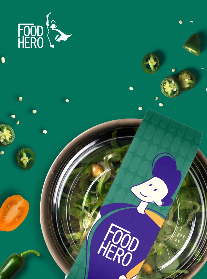
FoodHero specializes in all-day healthy eating.🥗Thanks to a wide range of programs and home delivery, they have won many clients.
The identity we designed for FoodHero responds to all these aspects. The basic element is the cartoon logo. A characteristic element of the brand are linear illustrations of hands in various gestures. Thanks to the variability of the drawings, we were able to shape the appearance of the website, but also create a distinctive identity for the entire brand.
#identity #brand #design #graphicdesign #creative #brandidentity #visualidentity #brandingdesign #designinspiration #eyeondesign #web #webdesign #graphicdesignui #ui #ux #uiux #website #websitedesign #portfolio #portfoliodesign #marketing #marketingdigital #microsite #app #appdesign #application
Nejstropy s.r.o. is a supplier of ceiling systems in the Czech Republic, Poland, Serbia and Romania.
The identification symbol of the logo is circles, which are the main support point of these ceiling systems. With the orange-red color combination, it completes the identity of the ceiling systems as the heart of the entire structure.
#identity #brand #design #graphicdesign #creative #brandidentity #visualidentity #brandingdesign #designinspiration #eyeondesign #web #webdesign #graphicdesignui #ui #ux #uiux #website #websitedesign #portfolio #portfoliodesign #marketing #marketingdigital #microsite #app #appdesign #application
SOS NEMOVITOSTI
The real estate company SOS Properties, specializing in the sale of luxury properties in the Czech Republic, has acquired a new logo and visual identity from our agency. Emphasizing readability and recognition, the logo combines simple icons of a house and location, providing versatility for use across the entire identity.
#identity #brand #design #graphicdesign #creative #brandidentity #visualidentity #brandingdesign #designinspiration #eyeondesign #web #webdesign #graphicdesignui #ui #ux #uiux #website #websitedesign #portfolio #portfoliodesign #marketing #marketingdigital #microsite #app #appdesign #application
GERO DRINKS
"Gero is an original gin inspired by Scandinavian culture. Carefully selected ingredients infuse the gin with the essence of Nordic forests, highlighting its unique character. It was a challenge for us to create a logo that emphasizes these qualities. The main idea was to maintain the elegance of a luxury drink while showcasing its distinctiveness.
The GERO brand identity relies on a bold logo and simple design. Typographic play and the deformation of the word `gero` provide a creative graphic element throughout the visual. In addition to the label and bottle design, we also crafted cans for mixed drinks."
#identity #brand #design #graphicdesign #creative #brandidentity #visualidentity #brandingdesign #designinspiration #eyeondesign #web #webdesign #graphicdesignui #ui #ux #uiux #website #websitedesign #portfolio #portfoliodesign #marketing #marketingdigital #microsite #app #appdesign #application
INX TATTOO
It was our honor to prepare a visual identity for an award-winning tattoo studio based in the Czech Republic
#identity #brand #design #graphicdesign #creative #brandidentity #visualidentity #brandingdesign #designinspiration #eyeondesign #web #webdesign #graphicdesignui #ui #ux #uiux #website #websitedesign #portfolio #portfoliodesign #marketing #marketingdigital #microsite #ink #tattoo #inktattoo #inktattoostudio #tattooart
SKILLBILL APP
SkillBill is a learning application that brings together a community of people interested in exploring new topics in an engaging way.
Various speakers cover interesting subjects ranging from technology to personal development. You can connect with them online or face-to-face.
In SkillBill, you won`t get lost—playful colors and visuals enhance the app`s navigation.
#identity #brand #design #graphicdesign #creative #brandidentity #visualidentity #brandingdesign #designinspiration #eyeondesign #web #webdesign #graphicdesignui #ui #ux #uiux #website #websitedesign #portfolio #portfoliodesign #marketing #marketingdigital #microsite #app #appdesign #application
MAT REAL ESTATE
Mat Reality: 20+ years in real estate. New logo, fresh identity! ♟️ Inspired by chess-Mate, in combination with the bridge Frydek-Mistek`s iconic bridge where it all began.
#identity #brand #design #graphicdesign #creative #brandidentity #visualidentity #brandingdesign #designinspiration #eyeondesign #web #webdesign #graphicdesignui #ui #ux #uiux #website #websitedesign #portfolio #portfoliodesign #marketing #marketingdigital #microsite

